# Docsy Shortcodes

> Use Docsy's Hugo shortcodes to quickly build site pages.

---

<!-- markdownlint-disable blanks-around-fence line-length -->
<!-- markdownlint-capture -->

Rather than writing all your site pages from scratch, Hugo lets you define and
use [shortcodes](https://gohugo.io/content-management/shortcodes/). These are
reusable snippets of content that you can include in your pages, often using
HTML to create effects that are difficult or impossible to do in simple
Markdown. Shortcodes can also have parameters that let you, for example, add
your own text to a fancy shortcode text box. As well as Hugo's
[built-in shortcodes](https://gohugo.io/content-management/shortcodes/), Docsy
provides some shortcodes of its own to help you build your pages.

## Shortcode delimiters

As illustrated below, using the bracket styled [shortcode delimiter][],
`{{<...>}}`, tells Hugo that the inner content is HTML/plain text and needs
no further processing. By using the delimiter `{{%...%}}`, Hugo will treat
the shortcode body as Markdown. You can use both styles in your pages.

## `blocks/*` shortcodes <a id="shortcode-blocks"></a> {#blocks}

The theme comes with a set of custom **Page Block** shortcodes that can be used
to compose landing pages, about pages, and similar.

These blocks share some common parameters:

- **height**: A pre-defined height of the block container. One of `min`, `med`,
  `max`, `full`, or `auto`.
  - `full`: the block fills the viewport height, which can be useful for landing
    pages with a [blocks/cover] and a translucent navbar.
  - `auto` leaves the block's minimum height unconstrained.
  - All other settings constrain the block's minimum height.

- **color**: The block will be assigned a color from the theme palette if not
  provided, but you can set your own if needed. You can use all of Bootstrap's
  color names, theme color names or a grayscale shade. Some examples would be
  `primary`, `white`, `dark`, `warning`, `light`, `success`, `300`, `blue`,
  `orange`. This will become the **background color** of the block, but text
  colors will adapt to get proper contrast.

### `blocks/cover` <a id="blockscover"></a> {#blocks-cover}

The **blocks/cover** shortcode creates a landing page type of block that fills
the top of the page. For example:

```html
{{< blocks/cover title="Welcome to Docsy!" height="auto td-below-navbar" >}}
...
{{< /blocks/cover >}}
```

For a full example, see [docsy.dev's home page][].

[docsy.dev's home page]:
  <https://github.com/google/docsy/blob/main/docsy.dev/content/en/_index.md?plain=1>

The shortcode parameters are:

| Parameter    | Default                        | Description                                 |
| ------------ | ------------------------------ | ------------------------------------------- |
| title        |                                | The main display title for the block.       |
| image_anchor |                                |                                             |
| height       |                                | See [blocks/\*](#blocks) and the note below |
| color        |                                | See [blocks/\*](#blocks)                    |
| byline       | Byline text on featured image. |                                             |

> [!NOTE] Below-navbar positioning <a id="td-below-navbar"></a>
>
> By default, cover blocks align with the top of the viewport, which means a
> fixed navbar overlays the top of the cover. To position the cover _below_ the
> navbar instead, add the `td-below-navbar` helper class to the `height`
> parameter. For example: `height="auto td-below-navbar"`.

To set the **background image** (also referred to as a **hero image**), place an
image with the word "background" in the name in the page's [page bundle][]. For
example, in our the example site the background image in the home page's cover
block is [featured-background.jpg], in the same directory.

> [!TIP]
>
> If you also include the word **featured** in the image name, e.g.
> `my-featured-background.jpg`, it will also be used as the Twitter Card image
> when shared.

[featured-background.jpg]:
  https://github.com/google/docsy-example/tree/main/content/en
[page bundle]: /docs/content/adding-content/#page-bundles

### `blocks/lead` <a id="blockslead"></a> {#blocks-lead}

The **blocks/lead** shortcode creates a lead/title block with centred text and
an arrow down pointing to the next section.

```go-html-template
{{% blocks/lead color="dark" %}}
TechOS is the OS of the future.

Runs on **bare metal** in the **cloud**!
{{% /blocks/lead %}}
```

| Parameter | Default  | Description               |
| --------- | -------- | ------------------------- |
| height    | `auto`   | See [`blocks/*`](#blocks) |
| color     | .Ordinal | See [`blocks/*`](#blocks) |

### `blocks/section` <a id="blockssection"></a> {#blocks-section}

The **blocks/section** shortcode is meant as a general-purpose content
container. It comes in two "flavors", one for general content and one with
styling more suitable for wrapping a horizontal row of feature sections.

The example below shows a section wrapping 3 feature sections.

```go-html-template
{{< blocks/section color="dark" type="row" >}}
{{% blocks/feature icon="fa-lightbulb" title="Fastest OS **on the planet**!" %}}
The new **TechOS** operating system is an open source project. It is a new project, but with grand ambitions.
Please follow this space for updates!
{{% /blocks/feature %}}
{{% blocks/feature icon="fa-brands fa-github" title="Contributions welcome!" url="https://github.com/gohugoio/hugo" %}}
We do a [Pull Request](https://github.com/gohugoio/hugo/pulls) contributions workflow on **GitHub**. New users are always welcome!
{{% /blocks/feature %}}
{{% blocks/feature icon="fa-brands fa-x-twitter" title="Follow us on Twitter!" url="https://twitter.com/GoHugoIO" %}}
For announcement of latest features etc.
{{% /blocks/feature %}}
{{< /blocks/section >}}
```

| Parameter | Default | Description                                                                                                                                          |
| --------- | ------- | ---------------------------------------------------------------------------------------------------------------------------------------------------- |
| `height`  |         | See above.                                                                                                                                           |
| `color`   |         | See above.                                                                                                                                           |
| `type`    |         | Specify "container" (the default) if you want a general container, or "row" if the section will contain columns -- which must be immediate children. |

### `blocks/feature` <a id="blocksfeature"></a> {#blocks-feature}

```go-html-template
{{% blocks/feature
  icon="fa-brands fa-github"
  title="Contributions welcome!"
  url="https://github.com/gohugoio/hugo"
  url_text="Pull Requests"
%}}

We do a [Pull Request](https://github.com/gohugoio/hugo/pulls) contributions
workflow on **GitHub**. New users are always welcome!

{{% /blocks/feature %}}
```

| Parameter | Default                                                            | Description    |
| --------- | ------------------------------------------------------------------ | -------------- |
| title     |                                                                    | Feature title  |
| url       |                                                                    | URL to link to |
| url_text  | The [language parameter][] value of [`ui_read_more`][ui_read_more] | Link text      |
| icon      |                                                                    | Icon class     |

[language parameter]: ../language/#internationalization-bundles
[ui_read_more]: <https://github.com/google/docsy/blob/main/i18n/en.yaml>

For available icons, see
[Font Awesome](https://fontawesome.com/icons?d=gallery&m=free).

### `blocks/link-down` <a id="blockslinkdown"></a> {#blocks-link-down}

The **blocks/link-down** shortcode creates a navigation link down to the next
section. It's meant to be used in combination with the other blocks shortcodes.

```go-html-template
<div class="mx-auto mt-5">
	{{< blocks/link-down color="info" >}}
</div>
```

| Parameter | Default | Description |
| --------- | ------- | ----------- |
| color     | info    | See above.  |

## Helper shortcodes <a id="helpers-shortcodes"></a> {#helpers-shortcodes}

### `alert`

> [!NOTE] Alerts in markdown syntax!
>
> As of Docsy [0.14.0][0.14.0-alerts], you can write alerts in markdown. For
> details, see [Alerts](/docs/content/adding-content/#alerts).
>
> [0.14.0-alerts]: /blog/2026/0.14.0/#alerts

Use the **alert** shortcode to display notices and warnings. The shortcode
renders a [Bootstrap alert component][bs-alert]. It can be used with Markdown
content and contain other shortcodes. For example:

```go-template
{{% alert title="Welcome" %}} **Hello**, world! {{% /alert %}}
```

Renders as:

<div class="alert alert-primary" role="alert"><div class="h4 alert-heading" role="heading">Welcome</div>

 **Hello**, world! </div>


Parameters:

- `title` (optional): Use this to specify a title for your alert. The title
  renders as a Bootstrap [alert heading][bs-alert], at heading level 4, using
  the `h4` Bootstrap class over a `<div>` element. This prevents the title from
  appearing in a page's table of contents.
- `color` (optional): Use this parameter to specify one of Bootstrap's
  predefined [alert variants][bs-alert], each of which has their own color.
  These include `primary`, `info`, and `warning`.

As of Docsy 0.13.0, the `alert` shortcode fully supports Markdown content. This
means that for Markdown shortcode calls like `{{% alert %}}`, your alert
can:

- Contain calls to other shortcodes (that is, nested shortcode calls).
- Share link definitions from/to other parts of the page.
- Be used in lists and other indented contexts.

Examples of these features are provided in the next section.

#### Alerts, indentation, and examples

When the `alert` shortcode is used in a Markdown context that requires
indentation, such as a list, then the alert _content_ (whether specified as
text/Markdown or a shortcode) must be indented accordingly. For example:

```go-template
- The following note is part of this list item:
  {{% alert title="Celebrate!" color=success %}}
  This alert is properly indented and rendered as part of the list item. Notice
  how a Markdown [link definition][] gets resolved even if it is defined
  _outside_ of the alert body.

  > Nested shortcode used here → Hello, world!
  {{% /alert %}}
  The first list item content continues here.

- **Don't put content on the same line** as the opening tag, it breaks rendering:
  {{% alert title="This alert's rendering is broken!" color=warning %}} **Notice
  how the alert content appears outside of the list!** {{% /alert %}}

[link definition]: # 'A link definition defined outside the alert body.'
```

This renders as:


<div class="td-max-width-on-larger-screens">

<!-- markdownlint-disable no-empty-links -->
<!-- prettier-ignore -->
- The following note is part of this list item:
  <div class="alert alert-success" role="alert"><div class="h4 alert-heading" role="heading">Celebrate!</div>


  This alert is properly indented and rendered as part of the list item. Notice
  how a Markdown [link definition][] gets resolved even if it is defined
  _outside_ of the alert body.

  > Nested shortcode used here → Hello, world!
  </div>

  The first list item content continues here.

- **Don't put content on the same line** as the opening tag, it breaks rendering:
  <div class="alert alert-warning" role="alert"><div class="h4 alert-heading" role="heading">This alert's rendering is broken!</div>

 **Notice
  how the alert content appears outside of the list!** </div>


[bs-alert]: https://getbootstrap.com/docs/5.3/components/alerts/
[link definition]: # 'A link definition defined outside the alert body.'

<!-- markdownlint-restore -->

### `pageinfo`

The **pageinfo** shortcode creates a text box that you can use to add banner
information for a page: for example, letting users know that the page contains
placeholder content, that the content is deprecated, or that it documents a beta
feature.

```go-template
{{% pageinfo color="info" %}}
This is _placeholder content_ :heart:
{{% /pageinfo %}}
```

Renders to:


<div class="pageinfo pageinfo-info">


This is _placeholder content_ :heart:


</div>


| Parameter | Default | Description                                                    |
| --------- | ------- | -------------------------------------------------------------- |
| color     | primary | One of the theme colors, eg `primary`, `info`, `warning`, etc. |

### `imgproc`

The **imgproc** shortcode finds an image in the current
[Page Bundle](/docs/content/adding-content/#page-bundles) and scales it given a
set of processing instructions.

```go-template
{{% imgproc spruce Fill "400x450" %}}
Norway Spruce *Picea abies* shoot with foliage buds.
{{% /imgproc %}}
```

Use the syntax above if the inner content and/or the `byline` parameter of your
shortcode is authored in markdown. In case of HTML content, use `<>` as
innermost delimiters: `{{< imgproc >}}<b>HTML</b> content{{< /imgproc >}}`.

<figure class="card rounded p-2 td-post-card mb-4 mt-4" style="max-width: 410px">
<img class="card-img-top" src="/docs/content/shortcodes/spruce_hu_4532ee0c20b74c3d.jpg" width="400" height="450">
<figcaption class="card-body px-0 pt-2 pb-0">
<p class="card-text">

 Norway Spruce _Picea abies_ shoot with
foliage buds. <small class="text-body-secondary"><br/>*Photo*: Bjørn Erik Pedersen / CC-BY-SA</small>
</p>
</figcaption>
</figure>


The example above has also a byline with photo attribution added. When using
illustrations with a free license from
[WikiMedia](https://commons.wikimedia.org/) and similar, you will in most
situations need a way to attribute the author or licensor. You can add metadata
to your page resources in the page front matter. The `byline` param is used by
convention in this theme:

<!-- markdownlint-disable -->
<!-- prettier-ignore-start -->


<ul class="nav nav-tabs" id="tabs-10" role="tablist">
  <li class="nav-item">
      <button class="nav-link disabled"
          id="tabs-10-00-tab" data-bs-toggle="tab" data-bs-target="#tabs-10-00" role="tab"
          aria-controls="tabs-10-00" aria-selected="false">
        Front matter:
      </button>
    </li><li class="nav-item">
      <button class="nav-link active"
          id="tabs-10-01-tab" data-bs-toggle="tab" data-bs-target="#tabs-10-01" role="tab"
          data-td-tp-persist="toml" aria-controls="tabs-10-01" aria-selected="true">
        toml
      </button>
    </li><li class="nav-item">
      <button class="nav-link"
          id="tabs-10-02-tab" data-bs-toggle="tab" data-bs-target="#tabs-10-02" role="tab"
          data-td-tp-persist="yaml" aria-controls="tabs-10-02" aria-selected="false">
        yaml
      </button>
    </li><li class="nav-item">
      <button class="nav-link"
          id="tabs-10-03-tab" data-bs-toggle="tab" data-bs-target="#tabs-10-03" role="tab"
          data-td-tp-persist="json" aria-controls="tabs-10-03" aria-selected="false">
        json
      </button>
    </li>
</ul>

<div class="tab-content" id="tabs-10-content">
    <div class="tab-pane fade"
        id="tabs-10-00" role="tabpanel" aria-labelled-by="tabs-10-00-tab" tabindex="10">
        <pre tabindex="0"><code></code></pre>
    </div>
    <div class="tab-pane fade show active"
        id="tabs-10-01" role="tabpanel" aria-labelled-by="tabs-10-01-tab" tabindex="10">
        <div class="highlight"><pre tabindex="0" class="chroma"><code class="language-toml" data-lang="toml"><span class="line"><span class="cl"><span class="err">+++</span>
</span></span><span class="line"><span class="cl"><span class="p">[[</span><span class="nx">resources</span><span class="p">]]</span>
</span></span><span class="line"><span class="cl"><span class="nx">src</span> <span class="p">=</span> <span class="s2">&#34;**spruce*.jpg&#34;</span>
</span></span><span class="line"><span class="cl">
</span></span><span class="line"><span class="cl">  <span class="p">[</span><span class="nx">resources</span><span class="p">.</span><span class="nx">params</span><span class="p">]</span>
</span></span><span class="line"><span class="cl">  <span class="nx">byline</span> <span class="p">=</span> <span class="s2">&#34;*Photo*: Bjørn Erik Pedersen / CC-BY-SA&#34;</span>
</span></span><span class="line"><span class="cl"><span class="err">+++</span></span></span></code></pre></div>
    </div>
    <div class="tab-pane fade"
        id="tabs-10-02" role="tabpanel" aria-labelled-by="tabs-10-02-tab" tabindex="10">
        <div class="highlight"><pre tabindex="0" class="chroma"><code class="language-yaml" data-lang="yaml"><span class="line"><span class="cl"><span class="nn">---</span><span class="w">
</span></span></span><span class="line"><span class="cl"><span class="nt">resources</span><span class="p">:</span><span class="w">
</span></span></span><span class="line"><span class="cl">- <span class="nt">src</span><span class="p">:</span><span class="w"> </span><span class="s2">&#34;**spruce*.jpg&#34;</span><span class="w">
</span></span></span><span class="line"><span class="cl"><span class="w">  </span><span class="nt">params</span><span class="p">:</span><span class="w">
</span></span></span><span class="line"><span class="cl"><span class="w">    </span><span class="nt">byline</span><span class="p">:</span><span class="w"> </span><span class="s2">&#34;*Photo*: Bjørn Erik Pedersen / CC-BY-SA&#34;</span><span class="w">
</span></span></span><span class="line"><span class="cl"><span class="nn">---</span></span></span></code></pre></div>
    </div>
    <div class="tab-pane fade"
        id="tabs-10-03" role="tabpanel" aria-labelled-by="tabs-10-03-tab" tabindex="10">
        <div class="highlight"><pre tabindex="0" class="chroma"><code class="language-json" data-lang="json"><span class="line"><span class="cl"><span class="p">{</span>
</span></span><span class="line"><span class="cl">  <span class="nt">&#34;resources&#34;</span><span class="p">:</span> <span class="p">[</span>
</span></span><span class="line"><span class="cl">    <span class="p">{</span>
</span></span><span class="line"><span class="cl">      <span class="nt">&#34;src&#34;</span><span class="p">:</span> <span class="s2">&#34;**spruce*.jpg&#34;</span><span class="p">,</span>
</span></span><span class="line"><span class="cl">      <span class="nt">&#34;params&#34;</span><span class="p">:</span> <span class="p">{</span>
</span></span><span class="line"><span class="cl">        <span class="nt">&#34;byline&#34;</span><span class="p">:</span> <span class="s2">&#34;*Photo*: Bjørn Erik Pedersen / CC-BY-SA&#34;</span>
</span></span><span class="line"><span class="cl">      <span class="p">}</span>
</span></span><span class="line"><span class="cl">    <span class="p">}</span>
</span></span><span class="line"><span class="cl">  <span class="p">]</span>
</span></span><span class="line"><span class="cl"><span class="p">}</span></span></span></code></pre></div>
    </div>
</div>

<!-- prettier-ignore-end -->
<!-- markdownlint-restore -->

| Parameter | Description                                                                                                                                                         |
| --------: | ------------------------------------------------------------------------------------------------------------------------------------------------------------------- |
|         1 | The image filename or enough of it to identify it (we do Glob matching)                                                                                             |
|         2 | Command. One of `Fit`, `Resize`, `Fill` or `Crop`. See [Image Processing Methods](https://gohugo.io/content-management/image-processing/#image-processing-methods). |
|         3 | Processing options, e.g. `400x450 r180`. See [Image Processing Options](https://gohugo.io/content-management/image-processing/#image-processing-options).           |

### `swaggerui`

You can place the `swaggerui` shortcode anywhere inside a page with the
[`swagger` layout](https://github.com/google/docsy/tree/main/layouts/swagger);
it renders [Swagger UI](https://swagger.io/tools/swagger-ui/) using any OpenAPI
YAML or JSON file as source. This file can be hosted anywhere you like, for
example in your site's root
[`/static` folder](/docs/content/adding-content/#adding-static-content).

<!-- markdownlint-disable -->
<!-- prettier-ignore-start -->


<ul class="nav nav-tabs" id="tabs-11" role="tablist">
  <li class="nav-item">
      <button class="nav-link disabled"
          id="tabs-11-00-tab" data-bs-toggle="tab" data-bs-target="#tabs-11-00" role="tab"
          aria-controls="tabs-11-00" aria-selected="false">
        Front matter:
      </button>
    </li><li class="nav-item">
      <button class="nav-link active"
          id="tabs-11-01-tab" data-bs-toggle="tab" data-bs-target="#tabs-11-01" role="tab"
          data-td-tp-persist="toml" aria-controls="tabs-11-01" aria-selected="true">
        toml
      </button>
    </li><li class="nav-item">
      <button class="nav-link"
          id="tabs-11-02-tab" data-bs-toggle="tab" data-bs-target="#tabs-11-02" role="tab"
          data-td-tp-persist="yaml" aria-controls="tabs-11-02" aria-selected="false">
        yaml
      </button>
    </li><li class="nav-item">
      <button class="nav-link"
          id="tabs-11-03-tab" data-bs-toggle="tab" data-bs-target="#tabs-11-03" role="tab"
          data-td-tp-persist="json" aria-controls="tabs-11-03" aria-selected="false">
        json
      </button>
    </li>
</ul>

<div class="tab-content" id="tabs-11-content">
    <div class="tab-pane fade"
        id="tabs-11-00" role="tabpanel" aria-labelled-by="tabs-11-00-tab" tabindex="11">
        <pre tabindex="0"><code></code></pre>
    </div>
    <div class="tab-pane fade show active"
        id="tabs-11-01" role="tabpanel" aria-labelled-by="tabs-11-01-tab" tabindex="11">
        <div class="highlight"><pre tabindex="0" class="chroma"><code class="language-toml" data-lang="toml"><span class="line"><span class="cl"><span class="err">+++</span>
</span></span><span class="line"><span class="cl"><span class="nx">title</span> <span class="p">=</span> <span class="s2">&#34;Pet Store API&#34;</span>
</span></span><span class="line"><span class="cl"><span class="nx">type</span> <span class="p">=</span> <span class="s2">&#34;swagger&#34;</span>
</span></span><span class="line"><span class="cl"><span class="nx">description</span> <span class="p">=</span> <span class="s2">&#34;Reference for the Pet Store API&#34;</span>
</span></span><span class="line"><span class="cl"><span class="err">+++</span>
</span></span><span class="line"><span class="cl">
</span></span><span class="line"><span class="cl"><span class="p">{{</span><span class="err">&lt;</span> <span class="nx">swaggerui</span> <span class="nx">src</span><span class="p">=</span><span class="s2">&#34;/openapi/petstore.yaml&#34;</span> <span class="err">&gt;</span><span class="p">}}</span></span></span></code></pre></div>
    </div>
    <div class="tab-pane fade"
        id="tabs-11-02" role="tabpanel" aria-labelled-by="tabs-11-02-tab" tabindex="11">
        <div class="highlight"><pre tabindex="0" class="chroma"><code class="language-yaml" data-lang="yaml"><span class="line"><span class="cl"><span class="nn">---</span><span class="w">
</span></span></span><span class="line"><span class="cl"><span class="nt">title</span><span class="p">:</span><span class="w"> </span><span class="l">Pet Store API</span><span class="w">
</span></span></span><span class="line"><span class="cl"><span class="nt">type</span><span class="p">:</span><span class="w"> </span><span class="l">swagger</span><span class="w">
</span></span></span><span class="line"><span class="cl"><span class="nt">description</span><span class="p">:</span><span class="w"> </span><span class="l">Reference for the Pet Store API</span><span class="w">
</span></span></span><span class="line"><span class="cl"><span class="nn">---</span><span class="w">
</span></span></span><span class="line"><span class="cl"><span class="w">
</span></span></span><span class="line"><span class="cl">{{<span class="l">&lt; swaggerui src=&#34;/openapi/petstore.yaml&#34; &gt;}}</span></span></span></code></pre></div>
    </div>
    <div class="tab-pane fade"
        id="tabs-11-03" role="tabpanel" aria-labelled-by="tabs-11-03-tab" tabindex="11">
        <div class="highlight"><pre tabindex="0" class="chroma"><code class="language-json" data-lang="json"><span class="line"><span class="cl"><span class="p">{</span>
</span></span><span class="line"><span class="cl">  <span class="nt">&#34;title&#34;</span><span class="p">:</span> <span class="s2">&#34;Pet Store API&#34;</span><span class="p">,</span>
</span></span><span class="line"><span class="cl">  <span class="nt">&#34;type&#34;</span><span class="p">:</span> <span class="s2">&#34;swagger&#34;</span><span class="p">,</span>
</span></span><span class="line"><span class="cl">  <span class="nt">&#34;description&#34;</span><span class="p">:</span> <span class="s2">&#34;Reference for the Pet Store API&#34;</span>
</span></span><span class="line"><span class="cl"><span class="p">}</span>
</span></span><span class="line"><span class="cl">
</span></span><span class="line"><span class="cl"><span class="p">{</span><span class="err">{&lt;</span> <span class="err">swaggerui</span> <span class="err">src=</span><span class="nt">&#34;/openapi/petstore.yaml&#34;</span> <span class="err">&gt;</span><span class="p">}</span><span class="err">}</span></span></span></code></pre></div>
    </div>
</div>

<!-- prettier-ignore-end -->
<!-- markdownlint-restore -->

> [!IMPORTANT]
>
> This shortcode relies on JavaScript libraries hosted on unpkg. Make sure that
> you can access unpkg from your network when building or loading your site.

To adjust Swagger UI's look and feel, customize the `.swagger-ui` class in your
[project's SCSS file][]. Docsy provides only minimal styling in its internal
`assets/scss/td/_swagger.scss` file.

> [!NOTE] Version note
>
> If you are upgrading from a version before 0.14.0 and previously customized
> Swagger styles by overriding `_swagger.scss`, see the
> [0.14.0 upgrade guide](/blog/2026/0.14.0/#swagger-scss) for migration steps.

[project's SCSS file]: lookandfeel/#project-style-files

### `redoc`

The `redoc` shortcode uses the open-source
[Redoc](https://github.com/Redocly/redoc) tool to render reference API
documentation from an OpenAPI YAML or JSON file. This can be hosted anywhere you
like, for example in your site's root
[`/static` folder](/docs/content/adding-content/#adding-static-content), but you
can use a URL as well, for example:

```yaml
---
title: Pet Store API
type: docs
weight: 1
description: Reference for the Pet Store API
---
{
  {
    </* redoc
    "https://raw.githubusercontent.com/OAI/OpenAPI-Specification/main/examples/v2.0/yaml/petstore.yaml"
    */>,
  },
}
```

### `iframe`

With this shortcode you can embed external content into a Docsy page as an
inline frame ([iframe]).

[iframe]: https://www.w3schools.com/tags/tag_iframe.asp

| Parameter     | Default                                                                                               | Description                                                                                                                                                                                                                                                                                                                                                                                                                                                                                              |
| ------------- | ----------------------------------------------------------------------------------------------------- | -------------------------------------------------------------------------------------------------------------------------------------------------------------------------------------------------------------------------------------------------------------------------------------------------------------------------------------------------------------------------------------------------------------------------------------------------------------------------------------------------------- |
| src           |                                                                                                       | URL of external content                                                                                                                                                                                                                                                                                                                                                                                                                                                                                  |
| width         | 100%                                                                                                  | Width of iframe                                                                                                                                                                                                                                                                                                                                                                                                                                                                                          |
| tryautoheight | true                                                                                                  | If true the shortcode tries to calculate the needed height for the embedded content using JavaScript, see [details](https://stackoverflow.com/questions/9162933?no-link-check). This is only possible if the embedded content is [on the same domain](https://stackoverflow.com/questions/22086722/resize-cross-domain-iframe-height?no-link-check). Note that even if the embedded content is on the same domain, it depends on the structure of the content if the height can be calculated correctly. |
| style         | min-height:98vh; border:none;                                                                         | CSS styles for the iframe. `min-height:98vh;` is a backup if `tryautoheight` doesn't work. `border:none;` removes the border from the iframe - this is useful if you want the embedded content to look more like internal content from your page.                                                                                                                                                                                                                                                        |
| sandbox       | false                                                                                                 | You can switch the sandbox completely on by setting `sandbox = true` or allow specific functionality with the common values for the iframe parameter `sandbox` defined in the [HTML standard](https://www.w3schools.com/tags/att_iframe_sandbox.asp).                                                                                                                                                                                                                                                    |
| name          | iframe-name                                                                                           | Specify the [name of the iframe](https://www.w3schools.com/tags/att_iframe_name.asp).                                                                                                                                                                                                                                                                                                                                                                                                                    |
| id            | iframe-id                                                                                             | Sets the ID of the iframe.                                                                                                                                                                                                                                                                                                                                                                                                                                                                               |
| class         |                                                                                                       | Optional parameter to set the classes of the iframe.                                                                                                                                                                                                                                                                                                                                                                                                                                                     |
| sub           | Your browser cannot display embedded frames. You can access the embedded page via the following link: | The text displayed (in addition to the embedded URL) if the user's browser can't display embedded frames.                                                                                                                                                                                                                                                                                                                                                                                                |

> [!WARNING]
>
> You can only embed external content from a server when its `X-Frame-Options`
> is not set or if it specifically allows embedding for your site. For details,
> see [X-Frame-Options].
>
> There are several tools you can use to check if a website can be embedded via
> iframe, such as [domsignal.com/x-frame-options-test]. Be aware that when this
> test says "Couldn’t find the X-Frame-Options header in the response headers."
> you **CAN** embed it, but when the test says "Great! X-Frame-Options header
> was found in the HTTP response headers as highlighted below.", you
> **CANNOT** - unless it has been explicitly enabled for your site.

[X-Frame-Options]:
  https://developer.mozilla.org/en-US/docs/Web/HTTP/Headers/X-Frame-Options
[domsignal.com/x-frame-options-test]: https://domsignal.com/x-frame-options-test

## Tabbed panes

Sometimes it's very useful to have tabbed panes when authoring content. One
common use-case is to show multiple syntax highlighted code blocks that showcase
the same problem, and how to solve it in different programming languages. As an
example, the tabbed pane below shows the language-specific variants of the
famous `Hello world!` program one usually writes first when learning a new
programming language:

<!-- markdownlint-disable no-missing-space-atx blanks-around-headings no-bare-urls single-h1 -->

<!-- prettier-ignore-start -->
<!-- cSpell:ignore cout println stdio stdlib endl -->


<ul class="nav nav-tabs" id="tabs-12" role="tablist">
  <li class="nav-item">
      <button class="nav-link active"
          id="tabs-12-00-tab" data-bs-toggle="tab" data-bs-target="#tabs-12-00" role="tab"
          data-td-tp-persist="c" aria-controls="tabs-12-00" aria-selected="true">
        C
      </button>
    </li><li class="nav-item">
      <button class="nav-link"
          id="tabs-12-01-tab" data-bs-toggle="tab" data-bs-target="#tabs-12-01" role="tab"
          data-td-tp-persist="c++" aria-controls="tabs-12-01" aria-selected="false">
        C++
      </button>
    </li><li class="nav-item">
      <button class="nav-link"
          id="tabs-12-02-tab" data-bs-toggle="tab" data-bs-target="#tabs-12-02" role="tab"
          data-td-tp-persist="go" aria-controls="tabs-12-02" aria-selected="false">
        Go
      </button>
    </li><li class="nav-item">
      <button class="nav-link"
          id="tabs-12-03-tab" data-bs-toggle="tab" data-bs-target="#tabs-12-03" role="tab"
          data-td-tp-persist="java" aria-controls="tabs-12-03" aria-selected="false">
        Java
      </button>
    </li><li class="nav-item">
      <button class="nav-link"
          id="tabs-12-04-tab" data-bs-toggle="tab" data-bs-target="#tabs-12-04" role="tab"
          data-td-tp-persist="kotlin" aria-controls="tabs-12-04" aria-selected="false">
        Kotlin
      </button>
    </li><li class="nav-item">
      <button class="nav-link"
          id="tabs-12-05-tab" data-bs-toggle="tab" data-bs-target="#tabs-12-05" role="tab"
          data-td-tp-persist="lua" aria-controls="tabs-12-05" aria-selected="false">
        Lua
      </button>
    </li><li class="nav-item">
      <button class="nav-link"
          id="tabs-12-06-tab" data-bs-toggle="tab" data-bs-target="#tabs-12-06" role="tab"
          data-td-tp-persist="php" aria-controls="tabs-12-06" aria-selected="false">
        PHP
      </button>
    </li><li class="nav-item">
      <button class="nav-link"
          id="tabs-12-07-tab" data-bs-toggle="tab" data-bs-target="#tabs-12-07" role="tab"
          data-td-tp-persist="python" aria-controls="tabs-12-07" aria-selected="false">
        Python
      </button>
    </li><li class="nav-item">
      <button class="nav-link"
          id="tabs-12-08-tab" data-bs-toggle="tab" data-bs-target="#tabs-12-08" role="tab"
          data-td-tp-persist="ruby" aria-controls="tabs-12-08" aria-selected="false">
        Ruby
      </button>
    </li><li class="nav-item">
      <button class="nav-link"
          id="tabs-12-09-tab" data-bs-toggle="tab" data-bs-target="#tabs-12-09" role="tab"
          data-td-tp-persist="scala" aria-controls="tabs-12-09" aria-selected="false">
        Scala
      </button>
    </li>
</ul>

<div class="tab-content" id="tabs-12-content">
    <div class="tab-pane fade show active"
        id="tabs-12-00" role="tabpanel" aria-labelled-by="tabs-12-00-tab" tabindex="12">
        <div class="highlight"><pre tabindex="0" class="chroma"><code class="language-C" data-lang="C"><span class="line"><span class="cl"><span class="cp">#include</span> <span class="cpf">&lt;stdio.h&gt;</span><span class="cp">
</span></span></span><span class="line"><span class="cl"><span class="cp">#include</span> <span class="cpf">&lt;stdlib.h&gt;</span><span class="cp">
</span></span></span><span class="line"><span class="cl">
</span></span><span class="line"><span class="cl"><span class="kt">int</span> <span class="nf">main</span><span class="p">(</span><span class="kt">void</span><span class="p">)</span>
</span></span><span class="line"><span class="cl"><span class="p">{</span>
</span></span><span class="line"><span class="cl">  <span class="nf">puts</span><span class="p">(</span><span class="s">&#34;Hello World!&#34;</span><span class="p">);</span>
</span></span><span class="line"><span class="cl">  <span class="k">return</span> <span class="n">EXIT_SUCCESS</span><span class="p">;</span>
</span></span><span class="line"><span class="cl"><span class="p">}</span></span></span></code></pre></div>
    </div>
    <div class="tab-pane fade"
        id="tabs-12-01" role="tabpanel" aria-labelled-by="tabs-12-01-tab" tabindex="12">
        <div class="highlight"><pre tabindex="0" class="chroma"><code class="language-C++" data-lang="C++"><span class="line"><span class="cl"><span class="cp">#include</span> <span class="cpf">&lt;iostream&gt;</span><span class="cp">
</span></span></span><span class="line"><span class="cl">
</span></span><span class="line"><span class="cl"><span class="kt">int</span> <span class="nf">main</span><span class="p">()</span>
</span></span><span class="line"><span class="cl"><span class="p">{</span>
</span></span><span class="line"><span class="cl">  <span class="n">std</span><span class="o">::</span><span class="n">cout</span> <span class="o">&lt;&lt;</span> <span class="s">&#34;Hello World!&#34;</span> <span class="o">&lt;&lt;</span> <span class="n">std</span><span class="o">::</span><span class="n">endl</span><span class="p">;</span>
</span></span><span class="line"><span class="cl"><span class="p">}</span></span></span></code></pre></div>
    </div>
    <div class="tab-pane fade"
        id="tabs-12-02" role="tabpanel" aria-labelled-by="tabs-12-02-tab" tabindex="12">
        <div class="highlight"><pre tabindex="0" class="chroma"><code class="language-Go" data-lang="Go"><span class="line"><span class="cl"><span class="kn">package</span><span class="w"> </span><span class="nx">main</span><span class="w">
</span></span></span><span class="line"><span class="cl"><span class="kn">import</span><span class="w"> </span><span class="s">&#34;fmt&#34;</span><span class="w">
</span></span></span><span class="line"><span class="cl"><span class="kd">func</span><span class="w"> </span><span class="nf">main</span><span class="p">()</span><span class="w"> </span><span class="p">{</span><span class="w">
</span></span></span><span class="line"><span class="cl"><span class="w">  </span><span class="nx">fmt</span><span class="p">.</span><span class="nf">Printf</span><span class="p">(</span><span class="s">&#34;Hello World!\n&#34;</span><span class="p">)</span><span class="w">
</span></span></span><span class="line"><span class="cl"><span class="p">}</span></span></span></code></pre></div>
    </div>
    <div class="tab-pane fade"
        id="tabs-12-03" role="tabpanel" aria-labelled-by="tabs-12-03-tab" tabindex="12">
        <div class="highlight"><pre tabindex="0" class="chroma"><code class="language-Java" data-lang="Java"><span class="line"><span class="cl"><span class="kd">class</span> <span class="nc">HelloWorld</span><span class="w"> </span><span class="p">{</span><span class="w">
</span></span></span><span class="line"><span class="cl"><span class="w">  </span><span class="kd">static</span><span class="w"> </span><span class="kd">public</span><span class="w"> </span><span class="kt">void</span><span class="w"> </span><span class="nf">main</span><span class="p">(</span><span class="w"> </span><span class="n">String</span><span class="w"> </span><span class="n">args</span><span class="o">[]</span><span class="w"> </span><span class="p">)</span><span class="w"> </span><span class="p">{</span><span class="w">
</span></span></span><span class="line"><span class="cl"><span class="w">    </span><span class="n">System</span><span class="p">.</span><span class="na">out</span><span class="p">.</span><span class="na">println</span><span class="p">(</span><span class="w"> </span><span class="s">&#34;Hello World!&#34;</span><span class="w"> </span><span class="p">);</span><span class="w">
</span></span></span><span class="line"><span class="cl"><span class="w">  </span><span class="p">}</span><span class="w">
</span></span></span><span class="line"><span class="cl"><span class="p">}</span></span></span></code></pre></div>
    </div>
    <div class="tab-pane fade"
        id="tabs-12-04" role="tabpanel" aria-labelled-by="tabs-12-04-tab" tabindex="12">
        <div class="highlight"><pre tabindex="0" class="chroma"><code class="language-Kotlin" data-lang="Kotlin"><span class="line"><span class="cl"><span class="k">fun</span> <span class="nf">main</span><span class="p">(</span><span class="n">args</span> <span class="p">:</span> <span class="n">Array</span><span class="p">&lt;</span><span class="n">String</span><span class="p">&gt;)</span> <span class="p">{</span>
</span></span><span class="line"><span class="cl">    <span class="n">println</span><span class="p">(</span><span class="s2">&#34;Hello, world!&#34;</span><span class="p">)</span>
</span></span><span class="line"><span class="cl"><span class="p">}</span></span></span></code></pre></div>
    </div>
    <div class="tab-pane fade"
        id="tabs-12-05" role="tabpanel" aria-labelled-by="tabs-12-05-tab" tabindex="12">
        <div class="highlight"><pre tabindex="0" class="chroma"><code class="language-Lua" data-lang="Lua"><span class="line"><span class="cl"><span class="n">print</span> <span class="s2">&#34;Hello world&#34;</span></span></span></code></pre></div>
    </div>
    <div class="tab-pane fade"
        id="tabs-12-06" role="tabpanel" aria-labelled-by="tabs-12-06-tab" tabindex="12">
        <div class="highlight"><pre tabindex="0" class="chroma"><code class="language-PHP" data-lang="PHP"><span class="line"><span class="cl"><span class="o">&lt;?</span><span class="nx">php</span>
</span></span><span class="line"><span class="cl"><span class="k">echo</span> <span class="s1">&#39;Hello World!&#39;</span><span class="p">;</span>
</span></span><span class="line"><span class="cl"><span class="cp">?&gt;</span><span class="err">
</span></span></span></code></pre></div>
    </div>
    <div class="tab-pane fade"
        id="tabs-12-07" role="tabpanel" aria-labelled-by="tabs-12-07-tab" tabindex="12">
        <div class="highlight"><pre tabindex="0" class="chroma"><code class="language-Python" data-lang="Python"><span class="line"><span class="cl"><span class="nb">print</span><span class="p">(</span><span class="s2">&#34;Hello World!&#34;</span><span class="p">)</span></span></span></code></pre></div>
    </div>
    <div class="tab-pane fade"
        id="tabs-12-08" role="tabpanel" aria-labelled-by="tabs-12-08-tab" tabindex="12">
        <div class="highlight"><pre tabindex="0" class="chroma"><code class="language-Ruby" data-lang="Ruby"><span class="line"><span class="cl"><span class="nb">puts</span> <span class="s2">&#34;Hello World!&#34;</span></span></span></code></pre></div>
    </div>
    <div class="tab-pane fade"
        id="tabs-12-09" role="tabpanel" aria-labelled-by="tabs-12-09-tab" tabindex="12">
        <div class="highlight"><pre tabindex="0" class="chroma"><code class="language-Scala" data-lang="Scala"><span class="line"><span class="cl"><span class="k">object</span> <span class="nc">HelloWorld</span> <span class="k">extends</span> <span class="nc">App</span> <span class="o">{</span>
</span></span><span class="line"><span class="cl">  <span class="n">println</span><span class="o">(</span><span class="s">&#34;Hello world!&#34;</span><span class="o">)</span>
</span></span><span class="line"><span class="cl"><span class="o">}</span></span></span></code></pre></div>
    </div>
</div>

<!-- prettier-ignore-end -->

The Docsy template provides two shortcodes `tabpane` and `tab` that let you
easily create tabbed panes. To see how to use them, have a look at the following
code block, which renders to a right aligned pane with one disabled and three
active tabs:

<!-- cSpell:ignore Herzlich willkommen Karibu sana -->

```go-html-template
{{< tabpane text=true right=true >}}
  {{% tab header="**Languages**:" disabled=true /%}}
  {{% tab header="English" lang="en" %}}
  ![Flag United Kingdom](flags/uk.png)
  **Welcome!**
  {{% /tab %}}
  {{< tab header="German" lang="de" >}}
    <img src="/docs/content/shortcodes/flags/de.png" alt="Flag Germany">
    <b>Herzlich willkommen!</b>
  {{< /tab >}}
  {{% tab header="Swahili" lang="sw" %}}
  ![Flag Tanzania](flags/tz.png)
  **Karibu sana!**
  {{% /tab %}}
{{< /tabpane >}}
```

This code translates to the right aligned tabbed pane below, showing a
`Welcome!` greeting in English, German or Swahili:

<!-- prettier-ignore-start -->


<ul class="nav nav-tabs justify-content-end" id="tabs-14" role="tablist">
  <li class="nav-item">
      <button class="nav-link disabled"
          id="tabs-14-00-tab" data-bs-toggle="tab" data-bs-target="#tabs-14-00" role="tab"
          aria-controls="tabs-14-00" aria-selected="false">
        <strong>Languages</strong>:
      </button>
    </li><li class="nav-item">
      <button class="nav-link active"
          id="tabs-14-01-tab" data-bs-toggle="tab" data-bs-target="#tabs-14-01" role="tab"
          data-td-tp-persist="english" aria-controls="tabs-14-01" aria-selected="true">
        English
      </button>
    </li><li class="nav-item">
      <button class="nav-link"
          id="tabs-14-02-tab" data-bs-toggle="tab" data-bs-target="#tabs-14-02" role="tab"
          data-td-tp-persist="german" aria-controls="tabs-14-02" aria-selected="false">
        German
      </button>
    </li><li class="nav-item">
      <button class="nav-link"
          id="tabs-14-03-tab" data-bs-toggle="tab" data-bs-target="#tabs-14-03" role="tab"
          data-td-tp-persist="swahili" aria-controls="tabs-14-03" aria-selected="false">
        Swahili
      </button>
    </li>
</ul>

<div class="tab-content" id="tabs-14-content">
    <div class="tab-body tab-pane fade"
        id="tabs-14-00" role="tabpanel" aria-labelled-by="tabs-14-00-tab" tabindex="14">
        
    </div>
    <div class="tab-body tab-pane fade show active"
        id="tabs-14-01" role="tabpanel" aria-labelled-by="tabs-14-01-tab" tabindex="14">
        <p><img src="/docs/content/shortcodes/flags/uk.png" alt="Flag United Kingdom">
<strong>Welcome!</strong></p>

    </div>
    <div class="tab-body tab-pane fade"
        id="tabs-14-02" role="tabpanel" aria-labelled-by="tabs-14-02-tab" tabindex="14">
        <p><img src="/docs/content/shortcodes/flags/de.png" alt="Flag Germany">
<strong>Herzlich willkommen!</strong></p>

    </div>
    <div class="tab-body tab-pane fade"
        id="tabs-14-03" role="tabpanel" aria-labelled-by="tabs-14-03-tab" tabindex="14">
        <p><img src="/docs/content/shortcodes/flags/tz.png" alt="Flag Tanzania">
<strong>Karibu sana!</strong></p>

    </div>
</div>

<!-- prettier-ignore-end -->

### Shortcode details

Tabbed panes are implemented using two shortcodes: `tabpane` containing two or
more nested `tab`s.

#### `tabpane`

The `tabpane` shortcode, which is the container element for the tabs, supports
the following named parameters, all of which are optional:

- **`lang`**: the default code-block language to use for all contained tabs
- **`highlight`**: parameter passed on to the code-block [highlight] function,
  as described below
- **`langEqualsHeader`**: set to `true` when header text matches the tab
  language.
- **`persist`**: one of `header`, `lang`, or `disabled`
- **`persistLang`**: deprecated, use `persist` instead
- **`right`**: set to `true` if you want right-aligned tabs
- **`text`**: set to `true` if the content of all contained tabs are text.
  Default is `false` and assumes the content is code.

The value of the optional parameters `lang` and `highlight` are passed on as
second `LANG` and third `OPTIONS` arguments to Hugo's built-in [highlight]
function, which is used to render the code blocks of the individual tabs.

Tab selection is persisted by default. When unspecified, `persist` defaults to
`header` when `text=true` or `lang` is set; otherwise `persist` defaults to
`lang`. To disable tab persistence, set `persist=disable`.

[highlight]: https://gohugo.io/functions/highlight/

#### `tab`

The `tab` shortcode represents the tabs you want to show. It supports the
following named parameters, all of which are optional:

- **`header`**: defines the tab's header text. When omitted it defaults to text
  of the form "Tab _n_". You can omit the parameter name if it is the only tab
  parameter:
  ```go-html-template
  {{< tab "My tab header" >}} … {{< /tab >}}
  ```
- **`lang`**: code-block language for code tabs
- **`highlight`**: parameter passed on to the code-block [highlight] function
- **`right`**: set to `true` in order to split tab panes into a left aligned and
  a right aligned tab groups. Specify `right=true` in the dividing tab. By using
  `right=true` more than once, you can even render multiple tab groups.
- **`disabled`**: set to `true` to disable a tab.
- **`text`**: set to `true` for text tabs. By default tabs are assumed to
  contain code.

For enabled tabs, there are two modes for content display, `code` representation
and _textual_ representation:

- By default, the tab's content is rendered as a code block. In order to get
  proper syntax highlighting, specify the named parameter `lang` --and
  optionally the parameter `highlight`-- for each tab. Parameters set in the
  parent `tabpane` shortcode will be overwritten.
- If the contents of your tabs should be rendered as text with different styles
  and optional images, specify `text=true` as parameter of your `tab`:

> [!NOTE] Reminder
>
> If your content is markdown, use the percent sign `%` as delimiter for your
> `tab` shortcode, like this:
>
> ```go-html-template
> {{% tab %}} Your \*\*markdown\*\* content {{% /tab %}}
> ```

## Card panes

When authoring content, it's sometimes very useful to put similar text blocks or
code fragments on card like elements, which can be optionally presented side by
side. Let's showcase this feature with the following sample card group which
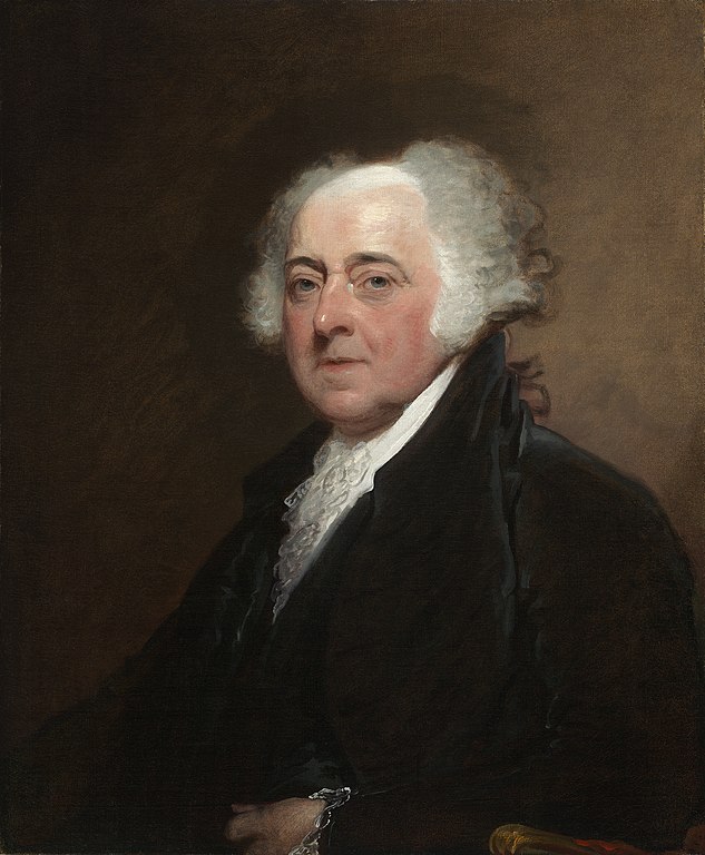
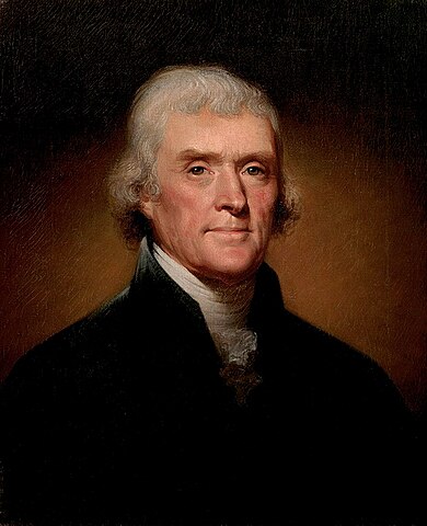
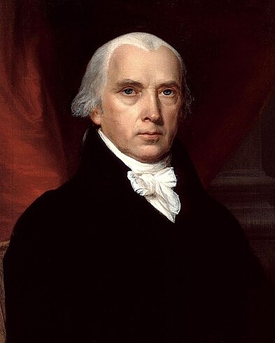
shows the first four Presidents of the United States:

<!-- Ensure signature images are readable in dark mode -->
<style>
  [data-bs-theme="dark"] .card-footer:has(> img) {
    --bs-card-cap-bg: #fff;
  }
</style>

<!-- prettier-ignore-start -->
<!-- Images: Wikimedia Commons -->
<div class="td-card-group card-group p-0 mb-4">

<div class="td-card card border me-4">
<div class="card-header">
      <strong>George Washington</strong>
    </div>
<div class="card-body">
    <h5 class="card-title">
        *1732     †1799</h5>
    <h6 class="card-title ms-2 text-body-secondary">
        <strong>President:</strong> 1789 – 1797</h6>
    <p class="card-text">
        <p><img src="/docs/content/shortcodes/card-pane/george-washington-portrait.jpg" alt="George Washington"></p>
</p>
      </div>
  <div class="card-footer">
      <img src="/docs/content/shortcodes/card-pane/george-washington-signature.png" alt="Signature George Washington"></div>
  </div>


<div class="td-card card border me-4">
<div class="card-header">
      <strong>John Adams</strong>
    </div>
<div class="card-body">
    <h5 class="card-title">
        *1735     †1826</h5>
    <h6 class="card-title ms-2 text-body-secondary">
        <strong>President:</strong> 1797 – 1801</h6>
    <p class="card-text">
        <p><img src="/docs/content/shortcodes/card-pane/john-adams-portrait.jpg" alt="John Adams"></p>
</p>
      </div>
  <div class="card-footer">
      <img src="/docs/content/shortcodes/card-pane/john-adams-signature.png" alt="Signature John Adams"></div>
  </div>


<div class="td-card card border me-4">
<div class="card-header">
      <strong>Thomas Jefferson</strong>
    </div>
<div class="card-body">
    <h5 class="card-title">
        *1743     †1826</h5>
    <h6 class="card-title ms-2 text-body-secondary">
        <strong>President:</strong> 1801 – 1809</h6>
    <p class="card-text">
        <p><img src="/docs/content/shortcodes/card-pane/thomas-jefferson-portrait.jpg" alt="Thomas Jefferson"></p>
</p>
      </div>
  <div class="card-footer">
      <img src="/docs/content/shortcodes/card-pane/thomas-jefferson-signature.png" alt="Signature Thomas Jefferson"></div>
  </div>


<div class="td-card card border me-4">
<div class="card-header">
      <strong>James Madison</strong>
    </div>
<div class="card-body">
    <h5 class="card-title">
        *1751     †1836</h5>
    <h6 class="card-title ms-2 text-body-secondary">
        <strong>President:</strong> 1809 – 1817</h6>
    <p class="card-text">
        <p><img src="/docs/content/shortcodes/card-pane/james-madison-portrait.jpg" alt="James Madison"></p>
</p>
      </div>
  <div class="card-footer">
      <img src="/docs/content/shortcodes/card-pane/james-madison-signature.png" alt="Signature James Madison"></div>
  </div>


</div>

<!-- prettier-ignore-end -->

Docsy supports creating such card panes via different shortcodes:

- The `cardpane` shortcode which is the container element for the various cards
  to be presented.
- The `card` shortcodes, with each shortcode representing an individual card.
  While cards are often presented inside a card group, a single card may stand
  on its own, too. A `card` shortcode can hold programming code, text, images or
  any other arbitrary kind of markdown or HTML markup as content. In case of
  programming code, cards provide automatic code-highlighting and other optional
  features like line numbers, highlighting of certain lines, ….

### Shortcode `card`: textual content

Make use of the `card` shortcode to display a card. The following code sample
demonstrates how to code a card element:

```go-html-template
{{< card
  header="**Imagine**"
  title="Artist and songwriter: John Lennon"
  subtitle="Co-writer: Yoko Ono"
  footer="![SignatureJohnLennon](https://server.tld/…/signature.png)"
>}}

Imagine there's no heaven, It's easy if you try<br/>
No hell below us, above us only sky<br/>
Imagine all the people living for today…

{{< /card >}}
```

This code translates to the left card shown below, showing the lyrics of John
Lennon's famous song `Imagine`. A second explanatory card element to the right
indicates and explains the individual components of a card:

<!-- prettier-ignore-start -->
<!-- markdownlint-disable -->

<div class="td-card-group card-group p-0 mb-4">

<div class="td-card card border me-4">
<div class="card-header">
      <strong>Imagine</strong>
    </div>
<div class="card-body">
    <h5 class="card-title">
        Artist and songwriter: John Lennon</h5>
    <h6 class="card-title ms-2 text-body-secondary">
        Co-writer: Yoko Ono</h6>
    <p class="card-text">
        

Imagine there's no heaven, It's easy if you try<br/>
No hell below us, above us only sky<br/>
Imagine all the people living for today…

Imagine there's no countries, it isn't hard to do<br/>
Nothing to kill or die for, and no religion too<br/>
Imagine all the people living life in peace…

Imagine no possessions, I wonder if you can<br/>
No need for greed or hunger - a brotherhood of man<br/>
Imagine all the people sharing all the world…

You may say I'm a dreamer, but I'm not the only one<br/>
I hope someday you'll join us and the world will live as one

</p>
      </div>
  <div class="card-footer">
      <img src="/docs/content/shortcodes/card-pane/john-lennon-signature.png" alt="SignatureJohnLennon"></div>
  </div>


<div class="td-card card border me-4">
<div class="card-header">
      <strong>Header</strong>: specified via named parameter <code>Header</code>
    </div>
<div class="card-body">
    <h5 class="card-title">
        <strong>Card title</strong>: specified via named parameter <code>title</code></h5>
    <h6 class="card-title ms-2 text-body-secondary">
        <strong>Card subtitle</strong>: specified via named parameter <code>subtitle</code></h6>
    <p class="card-text">
        <p><strong>Content</strong>: inner content of the shortcode, this may be plain text or formatted
text, images, videos, … . If your content is markdown, use the percent sign <code>%</code>
as outermost delimiter of your <code>card</code> shortcode, your markup should look like
<code>{{% card %}}Your **markdown** content{{% /card %}}</code>. In case of HTML
content, use square brackets <code>&lt;&gt;</code> as outermost delimiters:
<code>{{&lt; card &gt;}}Your &lt;b&gt;HTML&lt;/b&gt; content{{&lt; /card &gt;}}</code></p>
</p>
      </div>
  <div class="card-footer">
      <strong>Footer</strong>: specified via named parameter <code>footer</code></div>
  </div>


</div>


<!-- prettier-ignore-end -->
<!-- markdownlint-restore -->

While the main content of the card is taken from the inner markup of the `card`
shortcode, the optional elements `footer`, `header`, `title`, and `subtitle` are
all specified as named parameters of the shortcode.

### Shortcode `card`: programming code

If you want to display programming code on your card, set the named parameter
`code` of the card to `true`. The following sample demonstrates how to code a
card element with the famous `Hello world!` application coded in C:

```go-html-template
{{< card code=true header="**C**" lang="C" >}}
#include <stdio.h>
#include <stdlib.h>

int main(void)
{
  puts("Hello World!");
  return EXIT_SUCCESS;
}
{{< /card >}}
```

This code translates to the card shown below:

<!-- markdownlint-disable -->
<!-- prettier-ignore-start -->

    <div class="td-card card border me-4">
<div class="card-header code">
      <strong>C</strong>
    </div>
<div class="card-body code p-0 m-0">
    <div class="highlight"><pre tabindex="0" class="chroma"><code class="language-C" data-lang="C"><span class="line"><span class="cl"><span class="cp">#include</span> <span class="cpf">&lt;stdio.h&gt;</span><span class="cp">
</span></span></span><span class="line"><span class="cl"><span class="cp">#include</span> <span class="cpf">&lt;stdlib.h&gt;</span><span class="cp">
</span></span></span><span class="line"><span class="cl">
</span></span><span class="line"><span class="cl"><span class="kt">int</span> <span class="nf">main</span><span class="p">(</span><span class="kt">void</span><span class="p">)</span>
</span></span><span class="line"><span class="cl"><span class="p">{</span>
</span></span><span class="line"><span class="cl">  <span class="nf">puts</span><span class="p">(</span><span class="s">&#34;Hello World!&#34;</span><span class="p">);</span>
</span></span><span class="line"><span class="cl">  <span class="k">return</span> <span class="n">EXIT_SUCCESS</span><span class="p">;</span>
</span></span><span class="line"><span class="cl"><span class="p">}</span></span></span></code></pre></div></div>
  </div>

<!-- prettier-ignore-end -->
<!-- markdownlint-restore -->

<br/>If called with parameter `code=true`, the `card` shortcode can optionally
hold the named parameters `lang` and/or `highlight`. The values of these
optional parameters are passed on as second `LANG` and third `OPTIONS` arguments
to Hugo's built-in [`highlight`](https://gohugo.io/functions/highlight/)
function which is used to render the code block presented on the card.

### Card groups

Displaying two or more cards side by side can be easily achieved by putting them
between the opening and closing elements of a `cardpane` shortcode. The general
markup of a card group resembles closely the markup of a tabbed pane:

```go-html-template
{{< cardpane >}}
  {{< card header="Header card 1" >}}
    Content card 1
  {{< /card >}}
  {{< card header="Header card 2" >}}
    Content card 2
  {{< /card >}}
  {{< card header="Header card 3" >}}
    Content card 3
  {{< /card >}}
{{< /cardpane >}}
```

Contrary to tabs, cards are presented side by side, however. This is especially
useful if you want to compare different programming techniques (traditional vs.
modern) on two cards, like demonstrated in the example above:

<div class="td-card-group card-group p-0 mb-4"> 
    <div class="td-card card border me-4">
<div class="card-header code">
      <strong>Java 5</strong>
    </div>
<div class="card-body code p-0 m-0">
    <pre tabindex="0"><code>File[] hiddenFiles =
new File(&#34;directory_name&#34;) .listFiles(new FileFilter() { public boolean
accept(File file) { return file.isHidden(); } });</code></pre></div>
  </div>


    <div class="td-card card border me-4">
<div class="card-header code">
      <strong>Java 8, Lambda expression</strong>
    </div>
<div class="card-body code p-0 m-0">
    <pre tabindex="0"><code>File[] hiddenFiles
= new File(&#34;directory_name&#34;) .listFiles(File::isHidden);</code></pre></div>
  </div>

</div>


## Include external files

Sometimes there's content that is relevant for several documents, or that is
maintained in a file that is not necessarily a document. For situations like
these, the `readfile` shortcode allows you to import the contents of an external
file into a document.

### Reuse documentation

In case you want to reuse some content in several documents, you can write said
content in a separate file and include it wherever you need it.

For example, suppose you have a file called `installation.md` with the following
contents:

```go-html-template
## Installation

> [!IMPORTANT]
>
> Check system compatibility before proceeding.

1.  Download the installation files.
1.  Run the installation script `sudo sh install.sh`
1.  Test that your installation was successfully completed.
```

You can import this section into another document:

```go-html-template
The following section explains how to install the database:

{{% readfile "installation.md" %}}
```

This is rendered as if the instructions were in the parent document. Hugo
v0.101.0+ is required for imported files containing shortcodes to be rendered
correctly.

---

The following section explains how to install the database:


  <h2 id="installation">Installation<a class="td-heading-self-link" href="#installation" aria-label="Heading self-link"></a></h2>
<div class="td-alert td-alert--md alert alert-important" role="alert"><div class="td-alert-heading alert-heading" role="heading">Important</div>
  <div class="td-alert-body">
    <p>Check system compatibility before proceeding.</p>
    </div>
</div>
<ol>
<li>Download the installation files.</li>
<li>Run the installation script <code>sudo sh install.sh</code></li>
<li>Test that your installation was successfully completed.</li>
</ol>


---

The parameter is the relative path to the file. Only relative paths under the
parent file's working directory are supported.

For files outside the current working directory you can use an absolute path
starting with `/`. The root directory is the `/content` folder.

### Include code files

Suppose you have an `includes` folder containing several code samples you want
to use as part of your documentation. You can use `readfile` with some
additional parameters:

```go-html-template
To create a new pipeline, follow the next steps:

1. Create a configuration file `config.yaml`:

   {{< readfile file="includes/config.yaml" code="true" lang="yaml" >}}

1. Apply the file to your cluster `kubectl apply config.yaml`
```

This code automatically reads the content of `includes/config.yaml` and inserts
it into the document. The rendered text looks like this:

---

To create a new pipeline, follow the next steps:

1. Create a configuration file `config.yaml`:


     <div class="highlight"><pre tabindex="0" class="chroma"><code class="language-yaml" data-lang="yaml"><span class="line"><span class="cl"><span class="nt">apiVersion</span><span class="p">:</span><span class="w"> </span><span class="l">tekton.dev/v1beta1</span><span class="w">
   </span></span></span><span class="line"><span class="cl"><span class="nt">kind</span><span class="p">:</span><span class="w"> </span><span class="l">Task</span><span class="w">
   </span></span></span><span class="line"><span class="cl"><span class="nt">metadata</span><span class="p">:</span><span class="w">
   </span></span></span><span class="line"><span class="cl"><span class="w">  </span><span class="nt">name</span><span class="p">:</span><span class="w"> </span><span class="l">hello</span><span class="w">
   </span></span></span><span class="line"><span class="cl"><span class="nt">spec</span><span class="p">:</span><span class="w">
   </span></span></span><span class="line"><span class="cl"><span class="w">  </span><span class="nt">steps</span><span class="p">:</span><span class="w">
   </span></span></span><span class="line"><span class="cl"><span class="w">    </span>- <span class="nt">name</span><span class="p">:</span><span class="w"> </span><span class="l">echo</span><span class="w">
   </span></span></span><span class="line"><span class="cl"><span class="w">      </span><span class="nt">image</span><span class="p">:</span><span class="w"> </span><span class="l">alpine</span><span class="w">
   </span></span></span><span class="line"><span class="cl"><span class="w">      </span><span class="nt">script</span><span class="p">:</span><span class="w"> </span><span class="p">|</span><span class="sd">
   </span></span></span><span class="line"><span class="cl"><span class="sd">        #!/bin/sh
   </span></span></span><span class="line"><span class="cl"><span class="sd">        echo &#34;Hello World&#34;</span><span class="w">
   </span></span></span></code></pre></div>


1. Apply the file to your cluster `kubectl apply config.yaml`

---

> [!WARNING]
>
> You must use `{{< >}}` delimiters for the code highlighting to work
> correctly.

The `file` parameter is the relative path to the file. Only relative paths under
the parent file's working directory are supported.

For files outside the current working directory you can use an absolute path
starting with `/`. The root directory is the `/content` folder.

| Parameter | Default    | Description                                              |
| --------- | ---------- | -------------------------------------------------------- |
| file      |            | Path of external file                                    |
| code      | false      | Boolean value. If `true` the contents is treated as code |
| lang      | plain text | Programming language                                     |

### Error reporting

If the shortcode can't find the specified file, the shortcode throws a compile
error.

In the following example, Hugo throws a compile error if it can't find
`includes/deploy.yml`:

```go-html-template
{{< readfile file="includes/deploy.yaml" code="true" lang="yaml" >}}
```

Alternately, Hugo you can display a message on the rendered page instead of
throwing a compile error. Add `draft="true"` as a parameter. For example:

```go-html-template
{{< readfile file="includes/deploy.yaml" code="true" lang="yaml" draft="true" >}}
```

## Conditional text

The `conditional-text` shortcode allows you to show or hide parts of your
content depending on the value of the `buildCondition` parameter set in your
configuration file. This can be useful if you are generating different builds
from the same source, for example, using a different product name. This
shortcode helps you handle the minor differences between these builds.

```text
{{% conditional-text include-if="foo" %}}
This text appears in the output only if `buildCondition = "foo" is set in your config file`.
{{% /conditional-text %}}
{{% conditional-text exclude-if="bar" %}}
This text does not appear in the output if `buildCondition = "bar" is set in your config file`.
{{% /conditional-text %}}
```

If you are using this shortcode, note that when evaluating the conditions,
substring matches are matches as well. That means, if you set
`include-if="foobar"`, and `buildcondition = "foo"`, you have a match!

[shortcode delimiter]: https://gohugo.io/content-management/shortcodes/#notation
